What's New in FrameFlow v2026.1?
Learn What has Changed, What's Stayed the Same, and What's Coming Next
FrameFlow's first update of 2026 has landed. Included are some handy new event monitors and fixes that will improve your monitoring experience. In this article, we'll break down the most prominent changes. As always, you can view the total list of changes in our change log.
New Event Monitors: Entra ID Users and Devices Event Monitor
FrameFlow has created a new event monitor that's compatible with Entra ID. This new addition is perfect for users with hybrid environments who use Entra ID. It connects to Entra ID and monitors the state of all connected user accounts. You can receive alerts about conditions such as accounts that haven't logged in for a certain amount of time or accounts without multi-factor authentication enabled. Keeping tabs on stats like this can help you save money by removing stale accounts and ensure maximum security for each user account.
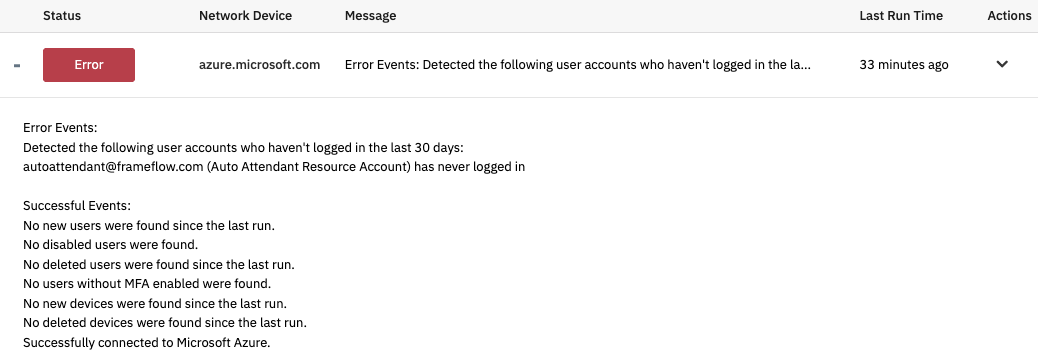 Sample Output for Entra ID Users and Devices
Azure Resources Event Monitor
Another great new tool for users with a cloud presence is our new Azure Resources Event Monitor. In Azure, everything from network connections to virtual machines is considered a resource and belongs to a resource group. This new event monitor lets you track changes to these resources, including resource additions, updates, or removal. Getting real-time updates on these changes can be helpful for auditing purposes. Not every change is logged by Azure, so let FrameFlow catch them and send you alerts!
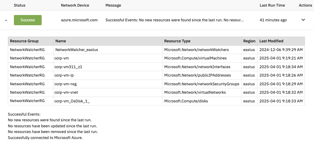 Sample Output for Azure Resources Monitor
App Version Event Monitor & Inventory Updates
The last new event monitor included in v2026.1 is our App Version Event Monitor. It's super handy for ensuring that all applications on connected servers and Intune devices stay updated for tighter security and better functionality. You can generate a table of out-of-date apps each time the event monitor runs, making it easy to go down the list and perform required updates quickly.
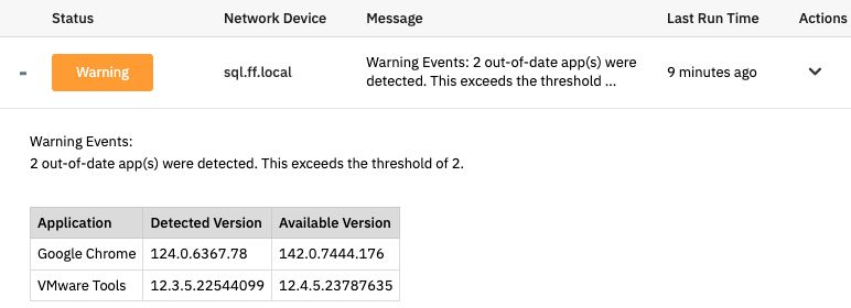 App Version Monitor Sample Output
Data Point Value Updates
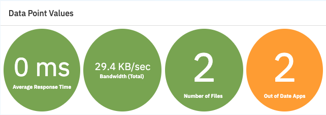
In v2026.1, we made several updates to the Dashboards section of FrameFlow, including the Data Point Value panel. Previously, the values displayed on the panel were rectangles and could not be modified. With the new update, you can change their shape to have more rounded corners or even appear as a circle.
 Circle Icons for Data Point Value Panel
We also added a new setting for the Data Point Value panel that lets you add a URL that will take you to a webpage when the panel is clicked. You can add a different URL for each value, like a link to the web interface of a switch or router. This helps you save time when investigating issues.
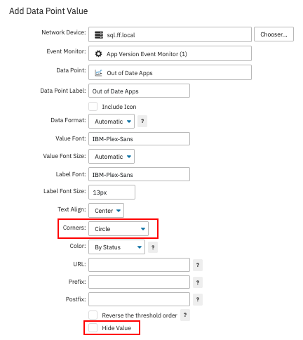 New Data Point Settings
We've also added the option to hide the data point values and instead show the color indicator and data point label. This is helpful for devices like cooling systems, for example, where it's less important to know the exact value and more important to quickly understand the status of that device and take corrective action.
Dashboard Graph Updates
Another area of Dashboards that we've improved in this update is the Dashboard Graph panel. Sometimes, when measuring certain metrics like the temperature of a piece of networking equipment, the variations were so small that our previous graphs struggled to display it meaningfully. That's why we added options to set minimum and maximum values for the y-axis. Continuing with the temperature example, this means you can now set the minimum temperature for the y-axis to 25 degrees and the maximum to 30 degrees. This way, you can view smaller value changes over time.
The same y-axis minimum and maximum settings can also help you control for large spikes in your graphs. Previously, if a bandwidth graph on your dashboard was set to show one-week increments and there was a spike in bandwidth, the highest value would dominate the entire graph until that data point expired. This made the other values on the graph harder to ascertain because the y-axis had to stretch to contain the highest data point. By setting the y-axis maximum to a smaller selected number, you can avoid this issue. Values higher than the max will still be recorded and you can view them by mousing over the spikes in the graph.
New: Dashboard Templates
You can now save your existing dashboards as a template to use to create other dashboards instead of starting from scratch. With this feature, you can create a dashboard pre-loaded with dashboard elements you find yourself reusing often and save it as a template for future dashboards. Using a basic template as a jumping off point like this can make creating new dashboards quicker and easier. You can view and manage your dashboard templates in the Dashboards section of Settings.
 Saving a Dashboard as a Template
Update Today & View Change Log
Now that you know about the changes we've made in FrameFlow v2026.1, update as soon as you can to test them out for yourself! You can view the total list of changes made in this update in our change log.
Try FrameFlow Now
Not a current FrameFlow user? With consistent software support and regular new features, FrameFlow is a world-class IT monitoring tool. Download our trial now to try FrameFlow for 30 days risk-free!