FrameFlow Report Elements Walkthrough 1
Learn all About Reports from FrameFlow and How to Use Them
FrameFlow Reports
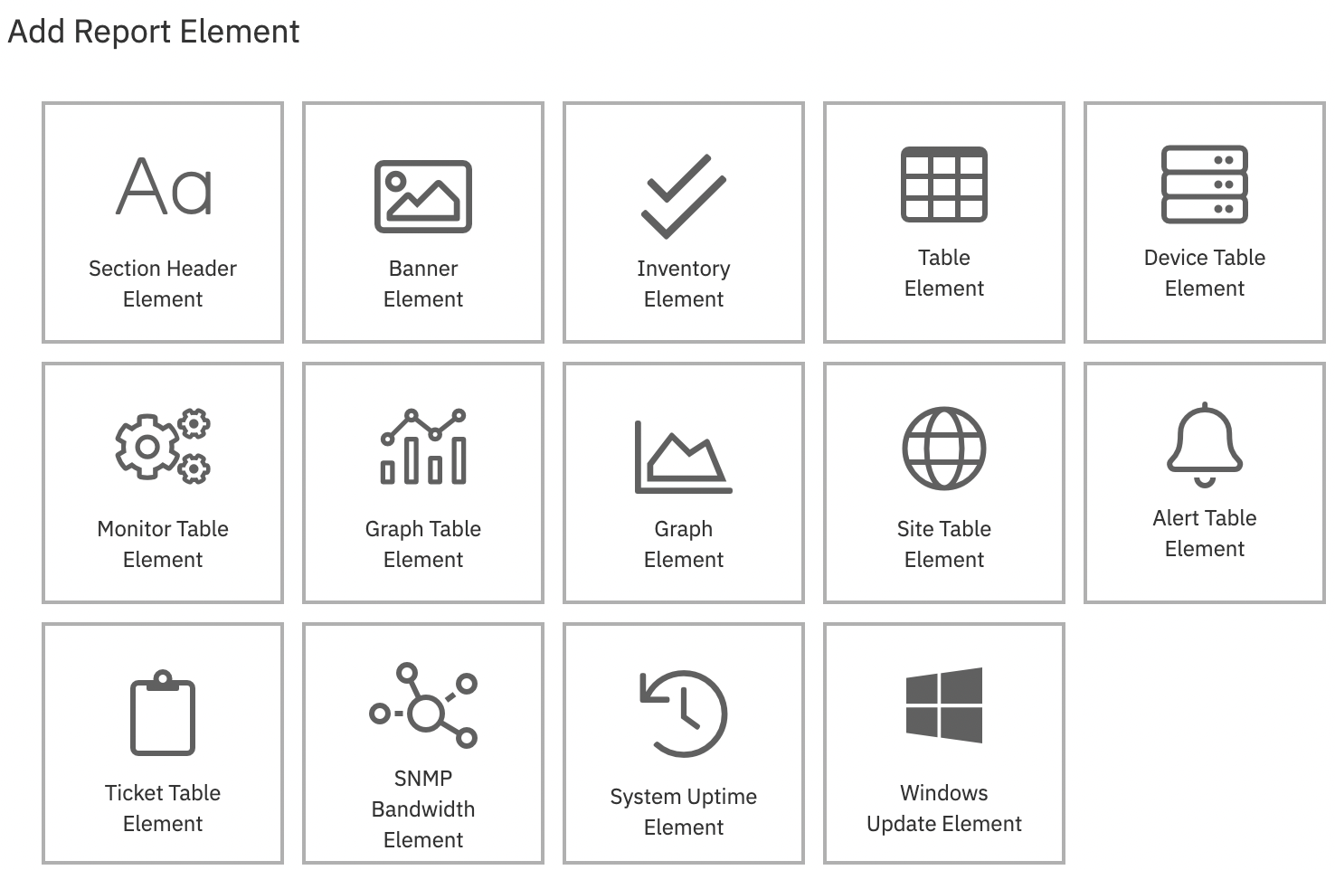
This blog post is the first in a pair of articles dedicated to our robust Reports section. Today, we're covering the first half of our handy report elements, which are the customizable moving parts that form a report. These two blog posts aim to teach you how to use each report element to create your ideal monitoring report, whether that's by making a report from scratch or by editing an existing template.
 Report Element Menu
If you're just now getting familiar with the reports section, check out our beginner's tutorial on the Reports section.
Section Header Element
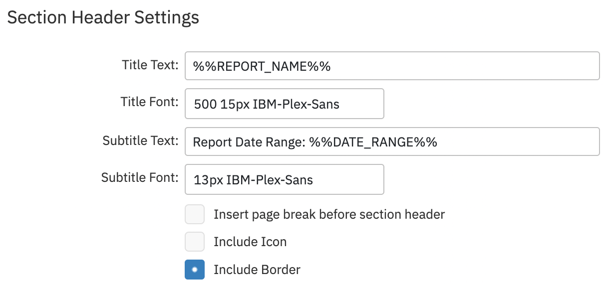
The section header report element creates a header for the title area of the report. In the settings for this report element, you can add a title and subtitle to your report. Choose the font of the title and subtitle as well as whether or not to include a page break, icon, or border with this element.
 Header Element
Banner Element
To create a banner for your report, choose the banner element. This report element lets you upload an image to be used as a banner instead of using the section header title. This allows you to create reports with company branding and logos.
 Report with Banner
In the above example, FrameFlow's logo serves as the banner for the report.
Inventory Element
The inventory element displays hardware inventory information taken from your inventory event monitors. In the settings for this report element, you can choose which network devices you want this element to include. You can structure your inventory data in an inventory table, summary header, or both. Select the type of inventory this table is gathering data for, then choose what this element will say if there's no data to pull from.
 Inventory Report Section Settings
The above example shows hardware inventory settings, but note that this report element can also be configured to display memory, application, CPU, or service inventory as well.
 Summary Report
Table Element
Use the table element to create a table for your report. This table can pull data from any of your existing event monitors and display up-to-date information each time you generate a new report. Choose a subset of devices, an event monitor, and a data point to create your table with. Add a title, subtitle, and the number of rows to show, then select a metric to sort the table by. The table will display the minimum, maximum, and average values for the data point you choose.
 Table Element Example
Note that the date range specified in the report settings controls the range of data that will be used for the report element.
Device Table Element
The device table element is much like the table element, but it details all the checks made by your event monitors on your network devices. It breaks down each associated device by the total number of monitoring actions performed on it during the report period. You can also use it to track the number of successes, the number of errors, and the success rate for the report period. By default, this element sorts devices by success rate, with the worst-performing devices at the top.
 Device Table Element
Monitor Table Element
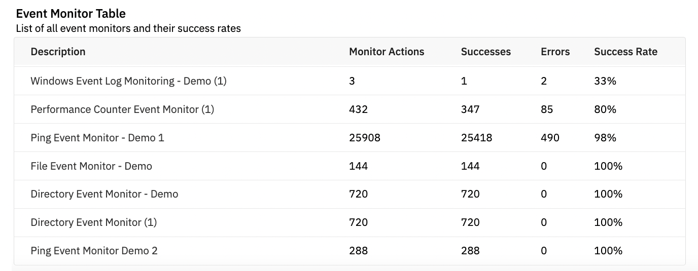
The monitor table element looks at the same data as the device table, but from a different perspective. With it, you can see all the checks each event monitor performs on its devices. The data is sorted by successes and failures in the subsequent columns. Also included is the success rate for the current report period.
 Monitor Table Example
Graph Table Element
The graph table element allows you to insert a set of related graphs into your report. This element is similar to the simple table element described above, but instead of rows of data, it displays data graphically.
 Graph Table Element
Graph Element
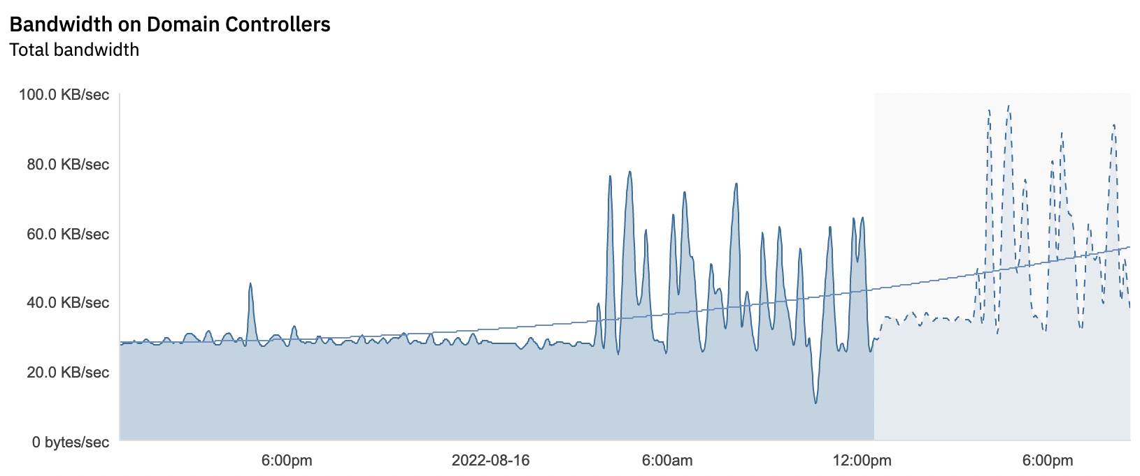
Graph elements are more in-depth than graph tables because of their ability to include more than one data point. You also have access to more accessory features like trend lines, predictions, and legends.
 Graph Element with Trend Line and Predictions
Summary
This article highlighted the first half of the report elements available in the Reports section of FrameFlow. We hope this helped you get the most out of our product! Check back in about a week for another blog post on the Reports section.
Are you new to FrameFlow? Download now to take it for a spin for free for 30 days and start taking advantage of its enterprise IT monitoring features.