Summary: Server Monitoring Dashboards
Learn about the Features and Functionality of FrameFlow Dashboards
About Dashboards
In the past few weeks, we’ve been releasing tutorials on our powerful and versatile dashboard panels. These panels all serve different roles in keeping your IT monitoring dashboards full of useful information. This article will touch on the different panel types and their purposes. More details on each panel mentioned can be found in the Features section of our website.
The Dashboards section is the single pane of glass view that contains all your important operations and metrics. You can make as many dashboards as suits your purposes and fill them with whatever information you like. Often, users will dedicate separate dashboards to certain sections of their overall monitoring configuration, creating a focused view of operations.
 Sample Dashboard
Many of our customers display their dashboards on large monitors in their network operations center, keeping their IT teams updated on problems in real-time. You can even create a slideshow of different dashboard displays, maximizing the information available to your team.
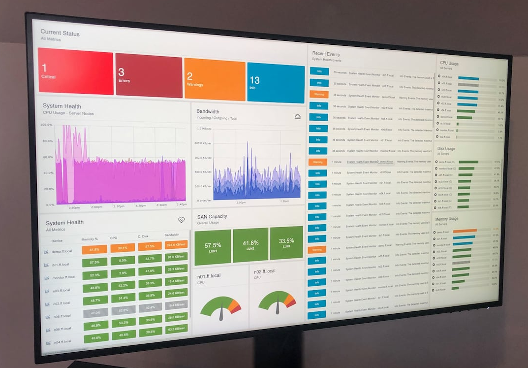 Monitor Displaying Dashboards
In our recent tutorial releases, we showcased several different dashboard panels and showed you how to use them. Each dashboard panel works together to create a cohesive representation of your monitoring configuration. We’ll explain a bit about each panel type below, but don’t forget to check out the corresponding tutorials for a deeper understanding of how to use each panel.
Data Point Dashboard Panels
FrameFlow offers two different dashboard panels that report on data points: the Data Point Value panel and the Data Point List panel. The Data Point Value panel singles out a particular data point (or multiple data points) and displays its current value on your dashboard. The Data Point List Panel displays a list of data points associated with a common event monitor, allowing you to keep track of data pertaining to that monitor. Find out more about these panels here.
 Data Point Panels
Alert Status Panels
Our Alert Status Panels offer an overall view of current alerts and status. The List of Current Alerts panel is an interactive panel containing all current alerts for a selected portion of your monitoring configuration. The Current Status Panel displays a breakdown of current alerts by status, where blue represents an info alert, orange represents warning, red represents error, and bright red represents critical. More on these panels can be found by visiting our Alert Status Panels tutorial.
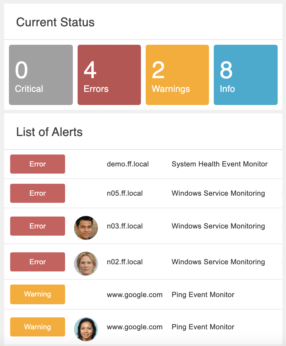 Alert Panels
Graphs
The Dashboards section is also home to FrameFlow's dynamic Graph panel. Use it to display important metrics based on data points. The data displayed by the graph is entirely customizable. There are also different graph styles available, leaving room for all use cases. Learn how to create graphs that are customized to your needs with our Graphs tutorial.
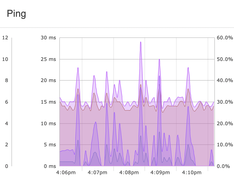 Sample Graph
System Health Panel
The System Health dashboard panel displays system health metrics on your dashboards for easy access. Use it to view system health details at a glance. Check out our System Health Dashboard Panel tutorial to learn how to select specific system health data to showcase.
 System Health Panel with Multiple Metrics
Event Monitor and Network Device List Panels
The Event Monitor and Network Device List panels display ordered lists of the items in your monitoring configuration, helping you to visualize information about your devices and monitors at a glance. There's even an option to monitor paused devices in this way so they aren't left forgotten and paused for longer than anticipated. Learn more about our List panels in the Features section of our website.
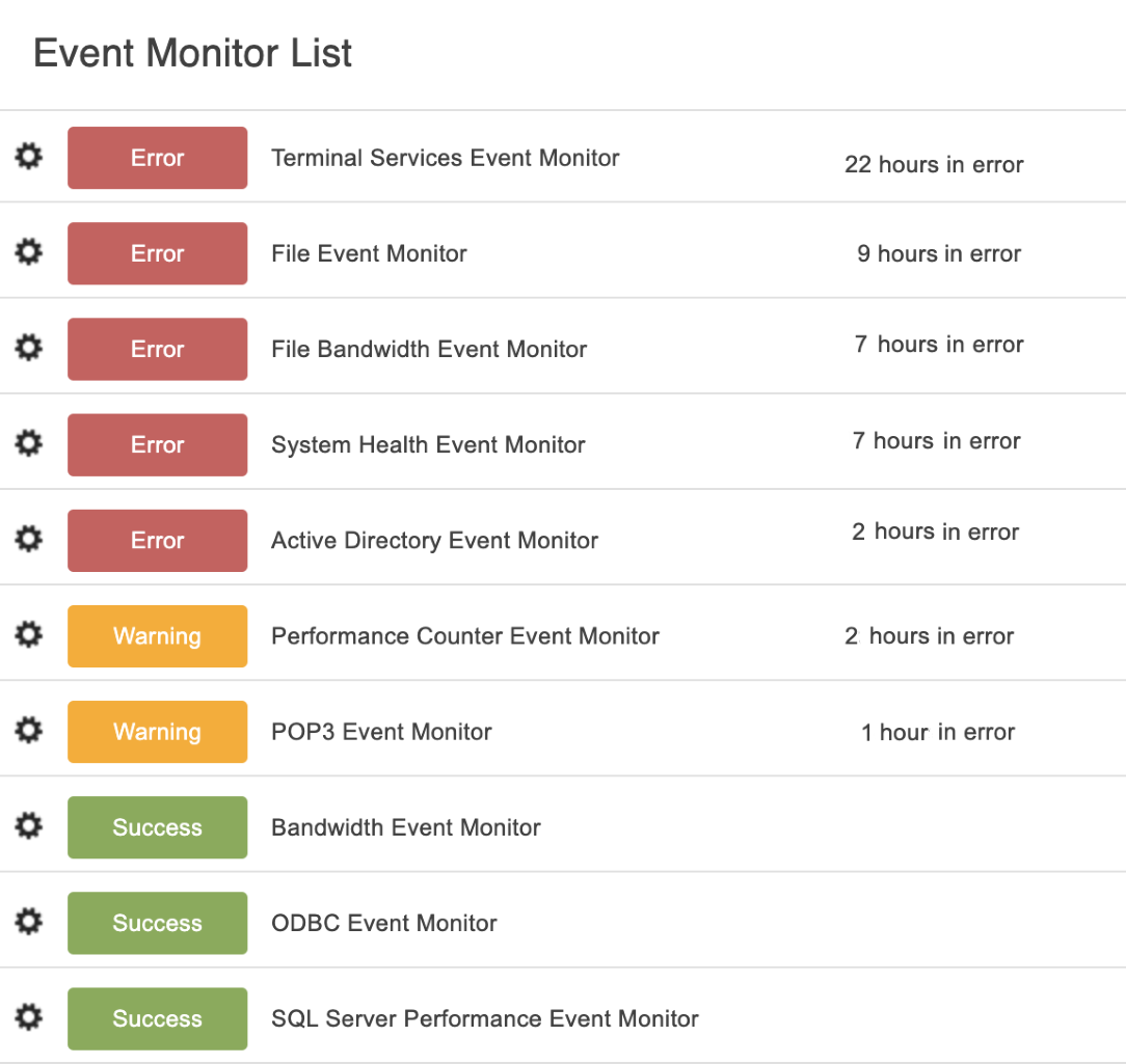 Event Monitor List Panel
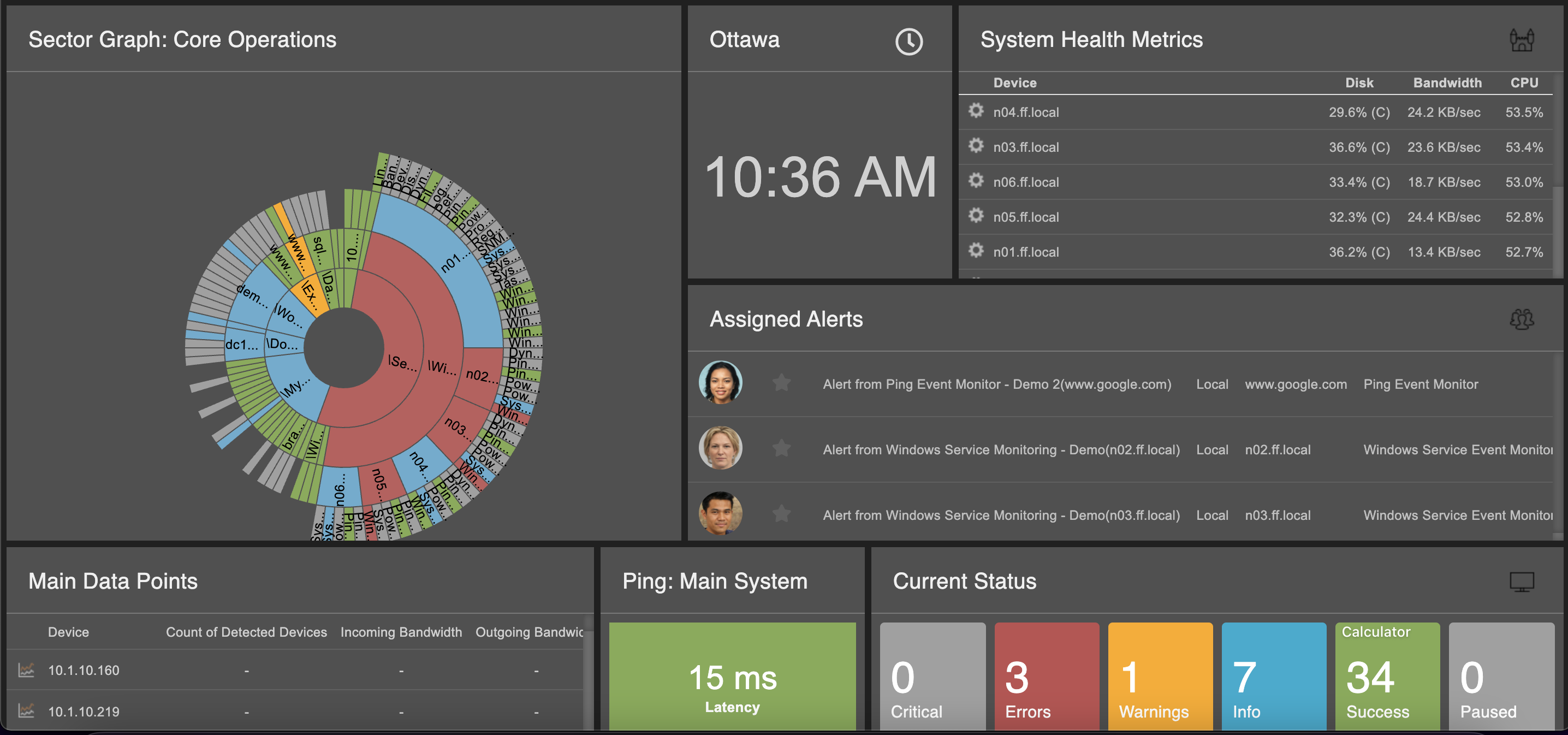
Sector Graphs
FrameFlow's Sector Graphs offer a bird's eye view of all your devices and monitors. The center wheel in a sector graph represents the topmost group in your monitoring configuration, while the outer concentric rings represent the rest of the hierarchy. Learn how to implement Sector Graphs in your Dashboard displays in our Sector Graphs tutorial.
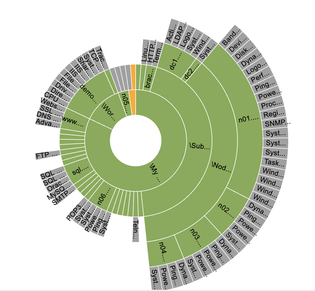 Sample Sector Graph
Event Monitor Queue Panel
The Event Monitor Queue panel lets you take a peek under the hood at the checks your event monitors are performing at any given moment. It shows the background processes that are vital to FrameFlow's monitoring operations so you can see what your event monitors are up to and verify that things are running smoothly. Learn more about the Event Monitor Queue panel by checking out its tutorial.
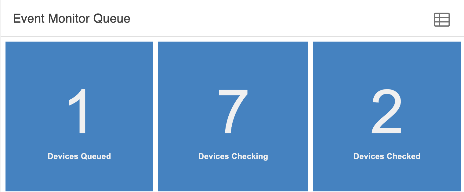 Event Monitor Queue Panel
Try FrameFlow Now
New to FrameFlow? Give us a try for 30 days for free and start taking advantage of our features risk-free. All our features are available during evaluation, including our customizable dashboards that let you interpret the status of your critical systems at a glance, 24/7.