FrameFlow Dashboard Walkthrough Part 1
Learn all About FrameFlow Dashboards
Dashboard Tutorials & More to Come
Recently, we've been working on some fresh new tutorials to highlight the various functions of FrameFlow's Dashboards section. The Dashboards section is an entirely customizable single pane of glass view of all your key IT operations. Customize the theme, panels, and contents to create a holistic view of all your critical systems.
You can create as many different dashboards as you like, leaving room to highlight every important metric with as much or as little detail as it requires. The following article highlights five different dashboard panels: Data Point Value, Data Point List, Graph, Current Status, and List of Alerts. We'll be adding a new bundle of tutorials on other Dashboards topics soon, so make sure to keep an eye on our Features page to learn all about them.
Data Point Dashboard Panels
FrameFlow offers two different dashboard panels that report on data points: the Data Point Value panel and the Data Point List panel. The Data Point Value panel singles out a particular data point (or multiple data points) and displays its current value on your dashboard. It's perfect for keeping a close eye on one or two particularly important metrics at all times.
 Two Data Point Values
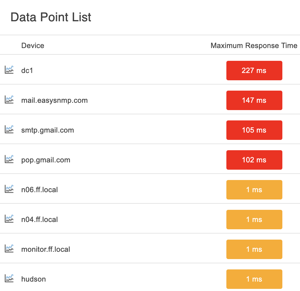
The Data Point List panel is similar but displays a list of data points associated with an event monitor. You can hand-select each metric displayed, allowing you to customize this panel to display what's important for your particular monitoring setup.
This panel can optionally have more than one column, allowing you to display related information side-by-side. To learn how to customize either one of these data point panels, check out our Data Point Dashboard Panels tutorial.
 Data Point List Panel
Alert Status Panels
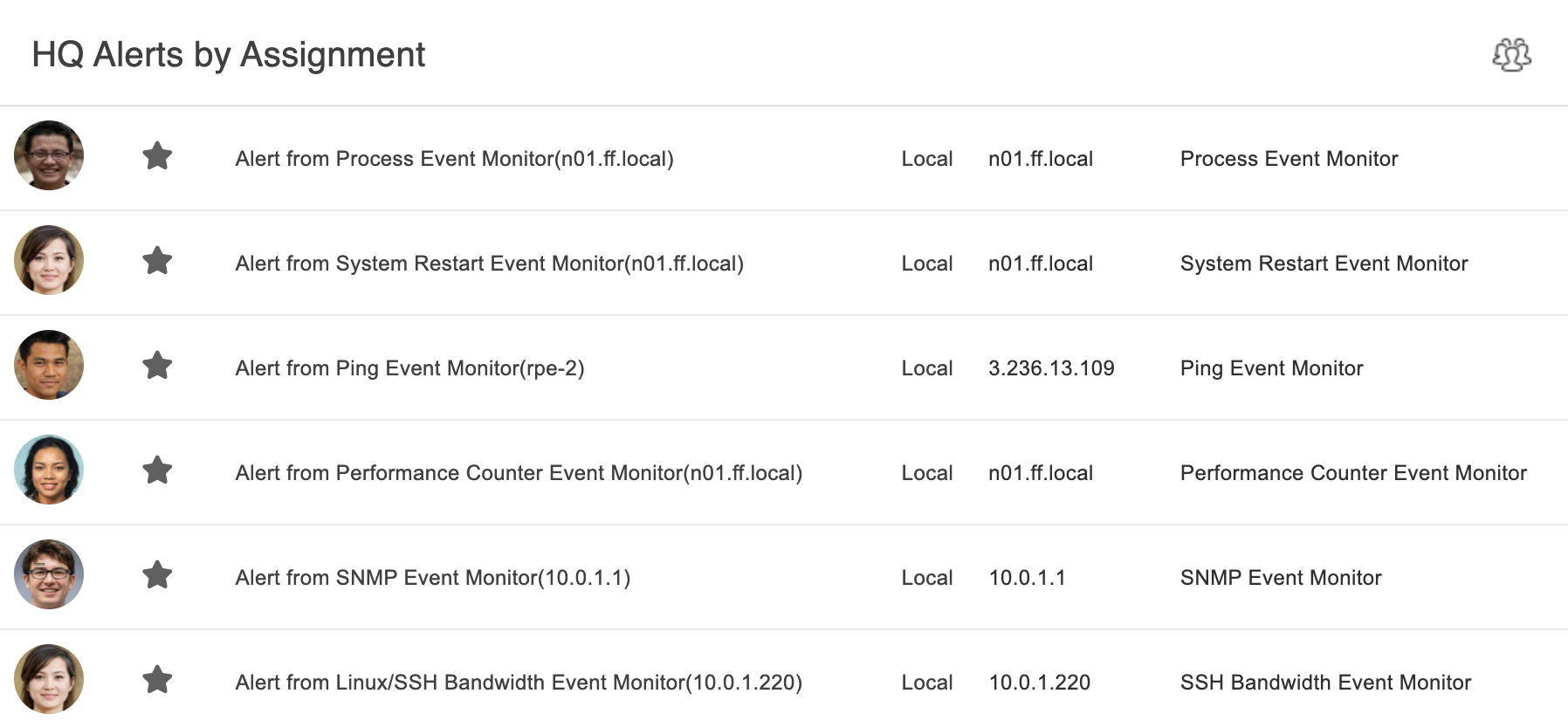
Two more panels available in our Dashboards section are the List of Current Alerts panel and the Current Status panel. The List of Current Alerts panel displays all or a selected group of current alerts. You can customize it to show only the alerts pertaining to your core operations, or keep it generalized to all active alerts. You can sort the alerts based on severity, active/suppressed alerts, and more.
 Current Assigned Alerts
The Current Status panel is a hub that shows current status much like the color-coded numbers at the top of any FrameFlow installation:
 Alert Counter
It displays the current number of alerts for each alert level. Blue represents info, yellow represents warning, orange represents error, and red represents critical, just like any other place within the FrameFlow interface. This dashboard panel can show two different values: the number of devices in each alerting state or the number of alerts of each level. These numbers will most often be different from one another, as one device can have multiple concurrent alerts.
 Number of Devices in Each State
To get the most out of these Alert Status dashboard panels, make sure to check out the Current Alerts/Current Status Dashboard Panel tutorial, found in the Features section of our site.
Graph Dashboard Panel
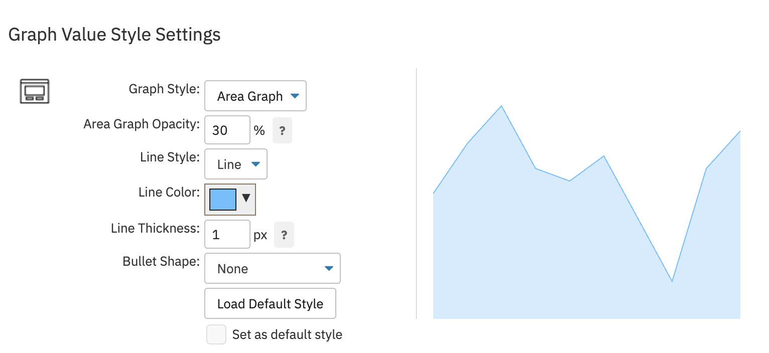
We also highlighted FrameFlow's infinitely customizable Graph dashboard panel in a recent tutorial. With the Graphs panel, you can create stunning graphs to display any monitoring information you please. With multiple customization options that control what information is displayed and the styling of the graph itself, we're confident that the panel is flexible enough for all use cases. Dig into its robust features and learn how to make the most of it today.
 Graph Style Settings
More to Come
But wait! That's not all. We plan to release two more sets of tutorials soon, which will be accompanied by two more blog posts. Make sure to check them out as well as the tutorials mentioned today. These tutorials seek to unveil some lesser-known features of our Dashboards section to make sure you're empowered to use them to their fullest extent, so don't miss out!
Try FrameFlow Now
Are you new to FrameFlow? Take it for a spin for free for 30 days and start taking advantage of its enterprise IT monitoring features, including incredibly customizable dashboards that let you interpret the status of your critical systems at a glance, 24/7.