Day 10: FrameFlow Dashboards
30 Days of FrameFlow
About Dashboards
FrameFlow's Dashboards section has all the tools for you to begin making beautiful and informative diagrams of your monitoring configuration. Mix and match over 25+ dashboard elements that receive and display data from our powerful event monitors. Dashboards can be displayed organization-wide on a large monitor to keep your teams informed at a glance. You can even create focused personal dashboards to share with a single employee or team.
Today, we'll walk you through getting started with Dashboards and link you to further resources on each panel type. When you begin, the default dashboards you'll find in the Dashboards section will be blank, as you most likely don't have the event monitors necessary to feed the dashboards with data yet. This will come with time as you progress through the 30 days.
Creating Your First Dashboard
To create your first dashboard, select the Dashboards section in the left menu bar. Then, in the tree section, right-click on the Dashboards item at the top and choose "Add New Dashboard". Now you have a blank canvas to work with and you can start designing your new visual tool as you like. The GIF below shows how to begin setting up a new dashboard.

The design of your dashboard is totally up to you and the information you're aiming to display. By right-clicking on the dashboard you just created, you can choose to add panels to your dashboard or change the theme, background, or view type (fullscreen or non-fullscreen mode).
Clicking "Finished Editing" from that menu will switch you into view-only mode. You can right-click at any time and select "Edit Dashboard" to return to editing mode. If you notice that your dashboard panels aren't displaying any new data, always check to ensure you aren't in dashboard editing mode before moving on to more advanced troubleshooting.

As mentioned, FrameFlow offers dozens of interactive and informative dashboard panels. Below, we'll describe each one and link to a more in-depth tutorial for further reading.
System Health Panel
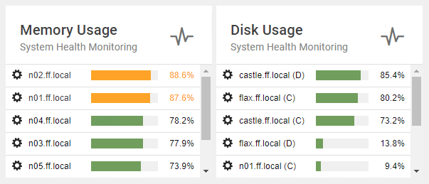
FrameFlow's System Health panel pulls in data from your System Health Event Monitors. From there, you can customize how it's displayed using various look and feel settings.

Alert Panels
Current Alert Panels display a live list of the most recent alerts. Use it to keep an eye on subsections of your monitoring setup and receive news of any issues ASAP.

Data Point Panels
FrameFlow's Data Point List and Data Point Value dashboard panels help you single out data points from your event monitors and network devices to display. The data point value panel shows the current value for a selected data point. The data point list panel shows data point values for multiple network devices associated with an event monitor.

Graphs Panel
With our graph dashboard panel, you can display important data in real time on all your company dashboards. You can even layer graphs to compare and contrast values over time.

Sector Graphs Panel
Sector Graphs are top-down visualization tools that display your event monitors and attached network devices. You can create sector graphs that represent your entire monitoring setup or select a subsection to highlight.

Event Monitor Queue Panel
Our Event Monitor Queue dashboard panel is an under-the-hood view of operations that shows the checks your event monitors are making in real-time. This panel is available in text form or as a stream graph.

Network Diagrams
Our Dashboards section is also home to a tool that helps you create complex diagrams that represent the network of assets you're monitoring. Network Diagrams are a visual tool that helps you map out your network devices and event monitors over space and time.

Summary
Now that you know a bit about each dashboard panel type, we encourage you to get creative and design custom dashboards that work for you. Tomorrow, we'll go over FrameFlow alerting.
| Day 9: Headquarters | Day 11: Alert Types |
Table of Contents
Back to Menu
Day 1: Intro and Installation
Day 2: FrameFlow's Interface
Day 3: Network Devices
Day 4: Your First Event Monitors
Day 5: Authentication Profiles
Day 6: Security
Day 7: System Health Event Monitor
Day 8: Event Monitors by Category
Day 9: Headquarters
Day 10: Dashboards
Day 11: Alert Types
Day 12: PowerShell Scripting
Day 13: Event History
Day 14: Reports and Inventory Monitoring
Day 15: Network Monitoring
Day 16: Cloud Service Monitoring
Day 17: Cloud Cost Monitoring
Day 18: Activity Monitoring
Day 19: Maintenance Windows
Day 20: Dependencies
Day 21: VMware Monitoring
Day 22: Benefits of Organization
Day 23: Assigning Device Types
Day 24: Security Best Practices
Day 25: Database Monitoring
Day 26: Hardware Monitoring
Day 27: Installation Health Event Monitor
Day 28: Multi-Site and Remote Nodes
Day 29: Failover Monitoring
Day 30: More FrameFlow Resources